Elements, groups, containers
Inside a node you usually add one or more components to define the node content. The available components are the ones you have registered using Box.registerComponents() and for whom you have created a flower.json configuration.
Elements
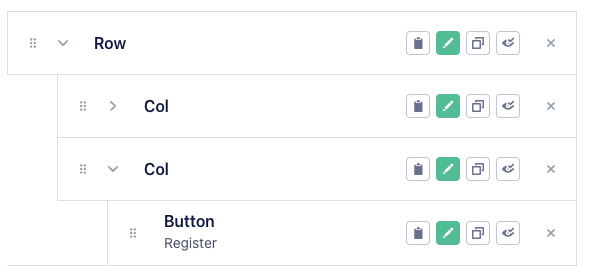
Node elements are just components. To add one, click on the Add element button. Once added, elements can be dragged and dropped to determine their position.
Every element row has a series of actions:
- Copy to clipboard: save the element in a sort of clipboard, from which you can add it in other parts of the flower;
- Edit: open the editing panel;
- Duplicate: duplicate the element;
- Hide: hide the element;
- Delete: delete the element.
Groups
Sometimes it is useful to have a reusable container that groups together multiple elements/components. It can be for instance a card component or a component with scrolling behaviour inside which you can then add other elements, from Flower visual editor.
To create a group, simply drag an element inside another one in the editor panel. The tree view will display the hierarchy of your elements.
You can drag and drop to change the elements' position, or create multiple levels of nesting.
The React component used as group will receive the content you added inside it in the children prop. For instance:
const Card = ({ cardTitle: title, children }) => (
  <div className="ui-card">
    <div className="ui-card__title">
      <h1>{title}</h1>
    </div>
    <div className="ui-card__content">
      {children}
    </div>
  </div>
)
Containers
Containers are special reusable nodes inside which you can add elements and groups. You will then be able to use the container content inside another element simply referencing the container name; this keeps your flower more modular and avoids too much cluttering in the element panel.
For instance you can have a list that accepts a container, used to render each item. In its configuration, add a SelectContainer to choose one of the containers available in your flower.
{
  "type": "component",
  "name": "List",
  "title": "List",
  "editing": [
    {
      "type": "Input",
      "id": "id",
      "label": "ID"
    },
    {
      "type": "SelectContainer",
      "label": "Item container",
      "id": "item_container"
    }
  ]
}
You can add a container from the Add + menu.